
Visual Identity
A strong visual identity is imperative because it creates a recognizable and cohesive presence, making it easier for the audience to identify, recognize, and connect with the brand.
The main visual identity for CAVAD starts with a lettermark which has rich ties to both CBU and CAVAD's history.
From this lettermark, official CAVAD lockups are systematically created.
Lettermark Logo
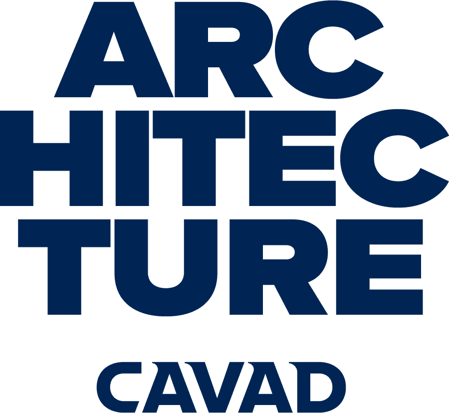
The CAVAD lettermark is the official logo of CAVAD. It was introduced in 2025, replacing the diamond icon, which represented CAVAD since its launch in 2012.
The lettermark pays homage to the diamond icon through its serifs, which are made by the four corner shapes of the original logo. The serifs, which fit perfectly within the notched ink traps of the CBU lettermark also tell the story of CAVAD's place within CBU: We are one of the many pieces of the puzzle that fit within the whole to make up the institution.
Logo & Lockup Hierarchy
CAVAD is unique within CBU as it has its own visual identity. Because we are both a sub-brand and also are subdivided into various programs, it is important to understand the various different logo uses and lockup options, and when to properly use each.
To maintain brand consistency, CAVAD Logos are grouped and separated into four tiers. The tiers are listed in descending order of formality and hierarchy.
Tier 1: University Logo
Tier 2: Formal CAVAD Lockups
Tier 3: CAVAD Lettermark
Tier 4: Unit Lockups
Tier 1: University logo
The university logo is the primary and official logo for California Baptist University. The logo locks up the bell tower icon to the left of the CBU lettermark. This the default identifying mark for all general university / institutional / brand use.
Shown below are the most commonly used university logos and their derivatives.
For more information and to download the CBU logos, visit cbubrand.guide


Tier 2: Formal CAVAD Lockups
For circumstances or applications where additional brand clarity is necessary, such as when creating materials geared towards a group of people who might not know what CAVAD stands for, a formal lockup bearing the full school name is available. This ensures that the acronym is immediately defined for new audiences.


Tier 3: CAVAD Lettermark
This logo is the primary and official logo for the College of Architecture, Visual Arts & Design. This is the default mark for all general brand use.
Tier 4: Unit Lockups
These lockups bring the school and university logos together with a program, major, division, office, or unit name. There are six different variations which can be used.


Logo & Lockup Usage Guidelines
Follow the guidelines below to ensure consistency in how the college logo is represented across all platforms, reinforcing recognition, recall, and trust. Use the guide to maintain a cohesive look and feel in every piece of content, regardless of who creates it, thereby preventing errors or misinterpretations.
The guidelines below are current as of 2026 and supersede any previously published brand / style guidelines.
Use approved colors
Specific brand colors have been designated for use with the logos and lockups.
Institutional lockups are preferred to appear in full color with Navy blue. White or Black one color options are available for when the full color versions are not suitable for the use case.
Formal CAVAD Lockups, the CAVAD Lettermark, and Unit Lockups may be used in Navy blue, Pacific blue, or White.
Do not use outdated logos
As we have progressed and grown, our identity has developed. In 2025 the CAVAD Lettermark replaced the original diamond logo from 2012 as the official logo representing the school. When in doubt, re-download CAVAD brand assets from the resources page to ensure you have the latest version.
Maintain clear space
Give the logo and lockups room to breathe by adding clear space. Clear space is defined as the area around the logo or lockup devoid of other logos, typography, graphics, and messaging. This area of isolation ensures the element stands out, and other design elements do not encroach on it, or visually compete with it. Maintain clear space as wide as the letter D.
This general rule applies to all CAVAD logos and lockups.

Never modify the logo
The logo has been intentionally arranged, sized, and colored to represent the CBU brand. For those reasons, the elements within the logo should never be stretched, skewed, recolored, or otherwise modified.
The rules below apply to all other marks and logos within this visual style guide.


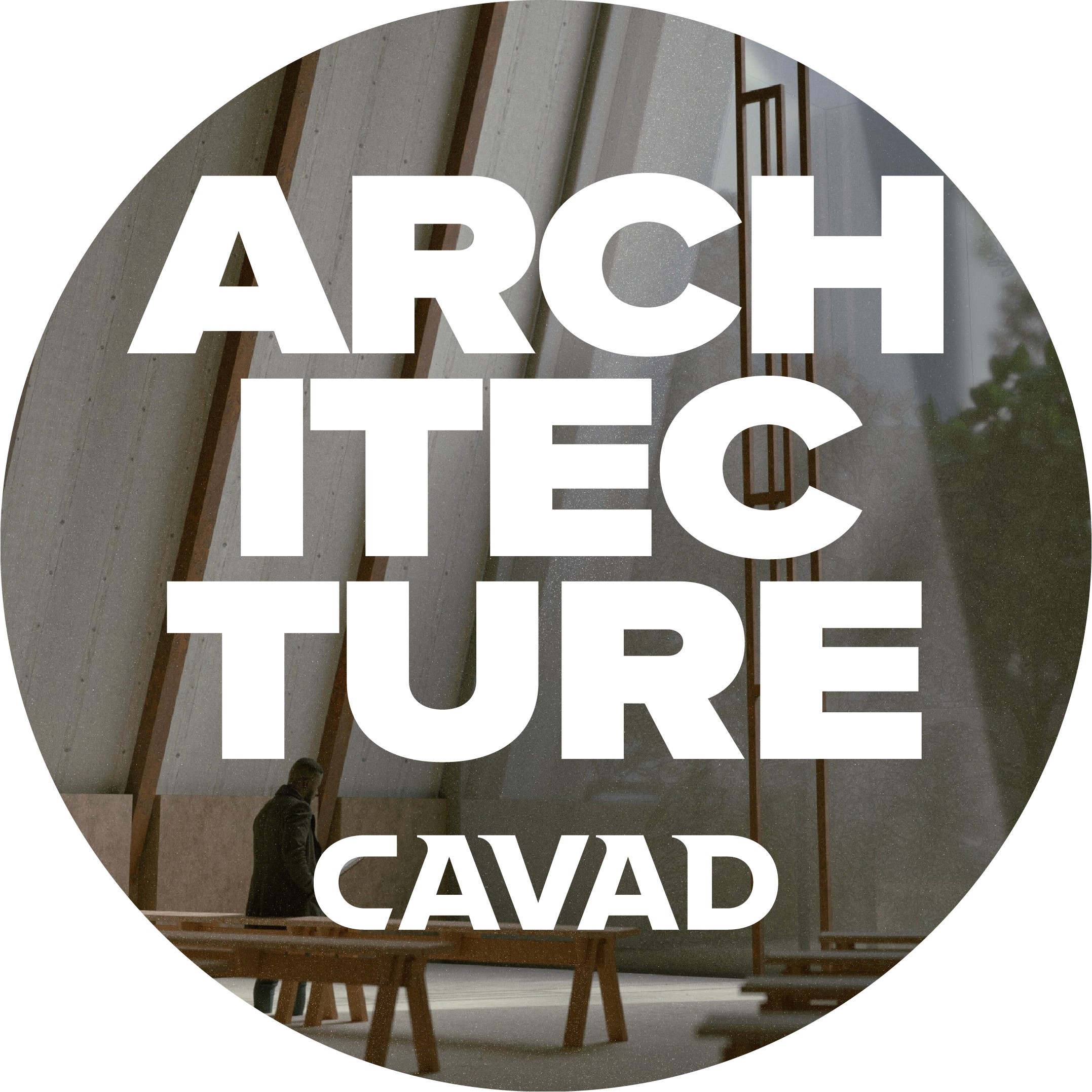
Don't use busy backgrounds
When placing the CAVAD lettermark or a lockup on top of an image, this is how to select a good image and create a good composition:
When it’s on top of a graphic or image, the default logo color is White. However, Pacific or Navy may be used when legibility would be compromised by using White.
The three examples on the right show improper image/mark use.
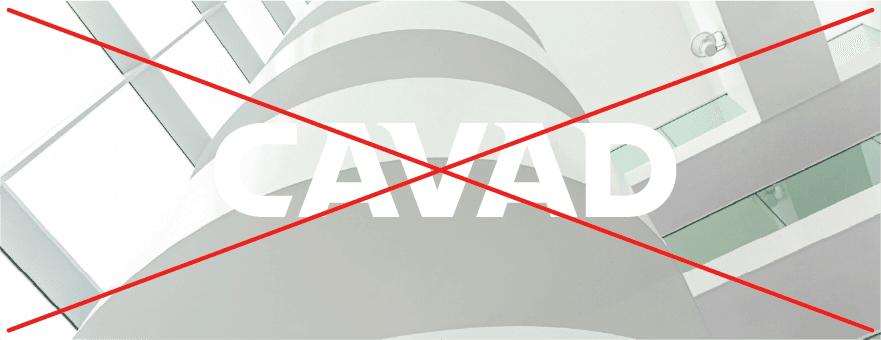
Top: Not enough contrast with the shirt and background. The mark should be white.
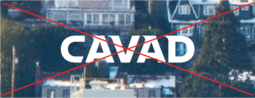
Middle: White mark blends into a light background. Use the navy version instead.
Bottom: The image is pixelated and fails quality standards. It shouldn’t be used.


Color
Colors are crucial for CAVAD's visual identity because they evoke emotions and associations, helping viewers instantly recognize and connect with the brand. Clear and consistent use of CAVAD's brand colors strengthens brand recall, tightens association with the greater institution, and creates a cohesive visual experience across all touchpoints.
Primary Palette
Pacific, Navy, & White are the official primary colors of the CAVAD brand. Together they play a vital role to define our visual language to internal and external audiences.
Follow the usage guidelines to determine how much of each color to use in your design.
Pacific
PRINT
CMYK: 100, 62, 0, 2
WEB
HEX #165FB3
RGB: 22, 95, 179
Navy
PRINT
PANTONE 655
CMYK: 100, 79, 12, 59
WEB
HEX #002554
RGB: 0, 37, 84
White
PRINT
PANTONE 000
CMYK: 0, 0, 0, 0
WEB
HEX #000000
RGB: 255, 255, 255
Secondary Palette
Three additional brand colors are available to be used sparingly and strategically. See usage guidelines below for more information.
Electric
PRINT
CMYK: 65, 7, 4, 0
WEB
HEX #5ACBF2
RGB: 90, 203, 242
Grey
PRINT
CMYK: 45, 33, 31, 1
WEB
HEX #939BA1
RGB: 147, 155, 161
Cream
PRINT
CMYK: 0, 2, 8, 0
WEB
HEX #FFFAEB
RGB: 255, 250, 235
Usage Guidelines
Follow the guidelines below to ensure consistency in how the CAVAD brand is represented across all platforms, reinforcing recognition, recall, and trust. Use the guide to maintain a cohesive look and feel in every piece of content, regardless of who creates it, thereby preventing errors or misinterpretations.
The guidelines below are current as of 2025 and supersede any previously published brand / style guidelines.
1. Primary color first
Any printed or digital materials that will remain in circulation for more than six months or are intended for external audiences (e.g., future students, donors, parents, etc.) should use these colors exclusively.
Secondary colors may be used for short-term or internal-facing communications.
2. Color balance
Designs using CAVAD colors should be 50% Navy, 30% White, and 20% Pacific.
Because Pacific is such a bold color, use it wisely. It is intended to bring energy and life to the brand without cheapening it.
Typography
Typography plays a vital role in CAVAD branding by expressing our brand's personality and tone, reinforcing its unity with CBU, and shaping how its message is perceived. Effective typography boosts readability and brand recognition, creating a unique and memorable visual identity that aligns with our brand and the university's core values.
Any materials that are going to remain in circulation for more than six months or are intended for off-campus audiences (e.g. future students, donors, parents, etc.) should use the primary and secondary typefaces (Proxima Nova and Sabon) exclusively.
Alternate typefaces can be used for short-term, campus-oriented communications, but graphic design best practices recommend using no more than two typefaces per communication piece (flyer, banner, digital advertisement, etc.)
Primary Typeface: Proxima Nova
Proxima Nova is the primary typeface used in all CAVAD marketing communications. The Proxima Nova font family offers a variety of weights and styles. These include Wide and Condensed styles, which are meant to be used as stylistic alternatives to bring energy and life to headlines.
Headlines & Body Copy
Proxima Nova
Stylistic Alternative for Headlines
Best used all-caps in thick weights
Stylistic Alternative for Headlines
Best used all-caps in thick weights

Secondary Typeface: Sabon
Sabon is used as a secondary typeface in some CAVAD marketing communications that require elegance (e.g., awards, letters, formal event invitations, etc.) The Sabon font family offers a variety of weights and styles.
Elegant Alternative
Alternate Typefaces: Arial & Garamond
Arial and Garamond are free alternate font options found on most PC and Mac computers. They should only be used if access to Proxima Nova or Sabon is unavailable.
Sans-Serif Alternate
Serif Alternate
Usage Guidelines
Follow the guidelines below to ensure consistency in how CAVAD typography is represented across all platforms, reinforcing recognition, recall, and trust. Use the guide to maintain a cohesive look and feel in every piece of content, regardless of who creates it, thereby preventing errors or misinterpretations.
The guidelines below are current as of 2025 and supersede any previously published brand/style guidelines.
1. Follow basic typography best practices
2. Do not use non-approved typeface/fonts for long term signage
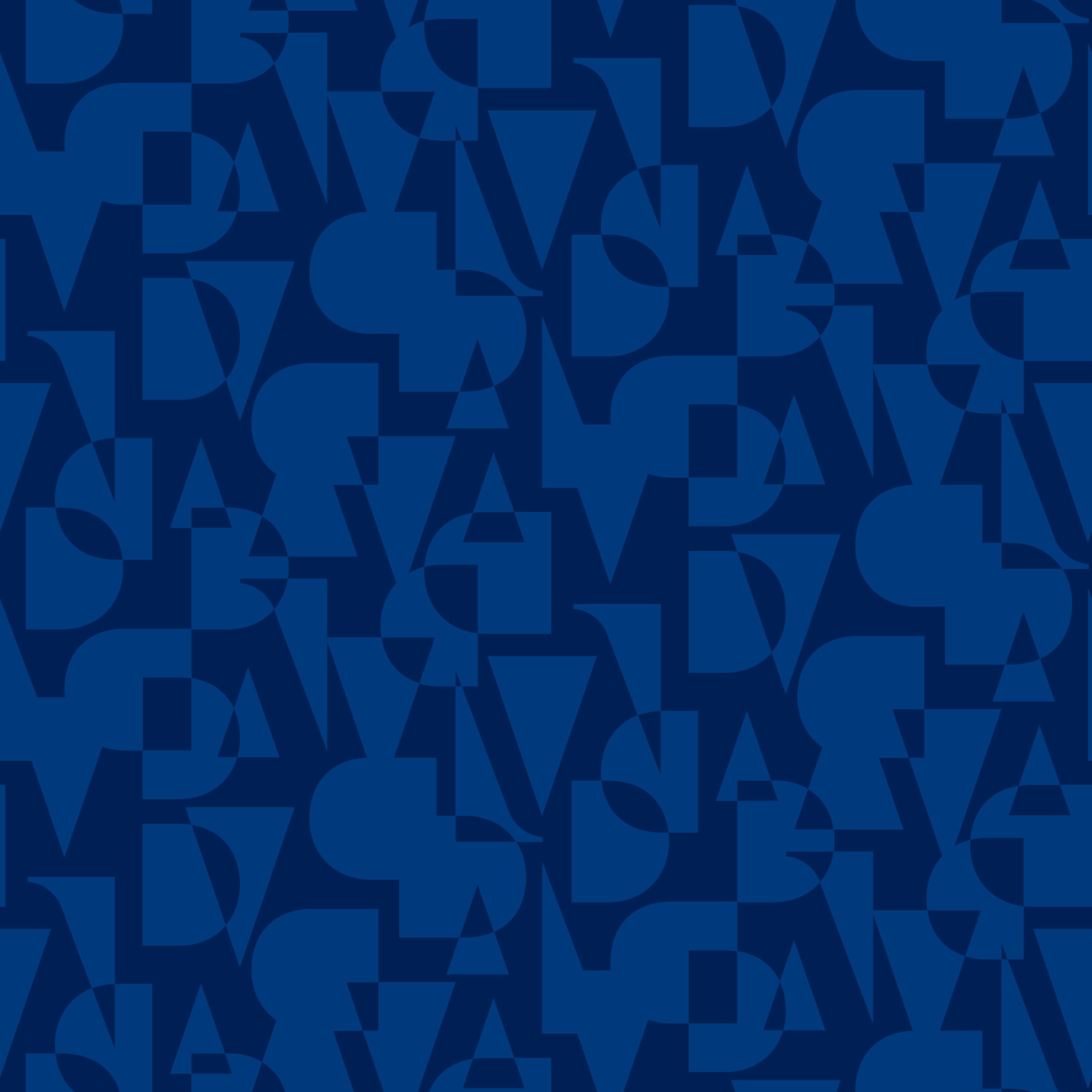
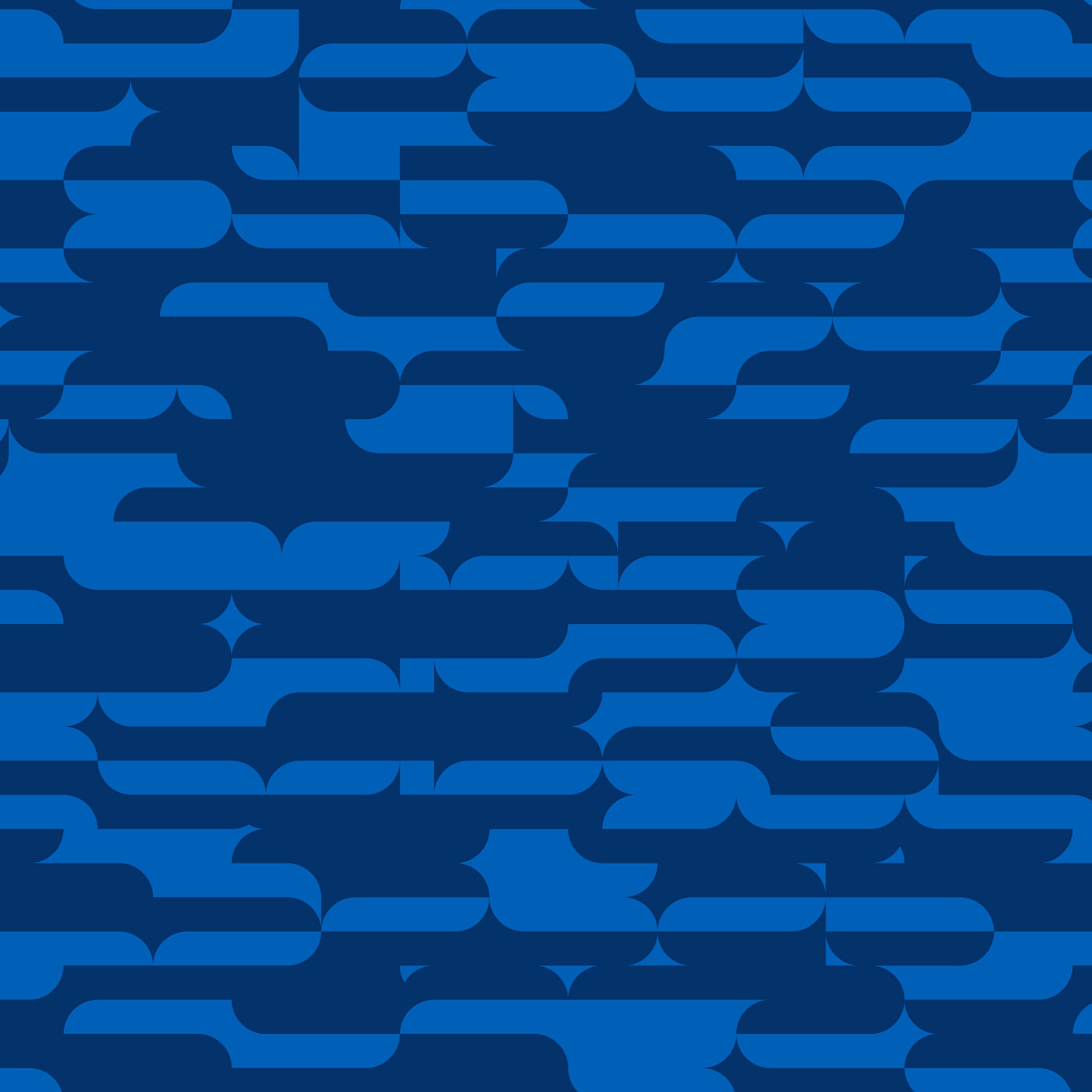
Patterns
Patterns can be used in CAVAD branding to add personality and texture to a design. They can be used as a subtle background, or in strips as stand-alone design elements. They should always be scaled up or down depending on the size of the finished work, so their design is not too small and cluttered, or too large and overbearing.
When used effectively, the CAVAD patterns add class and depth to a design, without cheapening it, detracting from the focal point, or being a distraction.
Appropriate uses include but are not limited to items such as certificates, environmental graphics, title slides.


If you have any questions, please contact Rene Lopez rlopez@calbaptist.edu